
Generating a Tailwind CSS Color Palette From Any Brand Hex — How We Built the Tool | TiltStack
Generating a Tailwind CSS Color Palette From Any Brand Hex — How We Built the Tool
The conversation goes the same way every time.
Client shares their brand guide. The primary color is #1e8fd3 — a specific, deliberate
shade of blue that their marketing team chose, their logo uses, and their print collateral
has been consistent on for six years. It is emphatically not Tailwind's blue-500
(#3b82f6). It is not sky-500 (#0ea5e9). It's their blue. Non-negotiable.
We open tailwind.config.js. We need brand-50 through brand-950 — ten stops, each
harmonious with the base, none colliding with the contrast ratios their accessible UI
requires. Tailwind ships gorgeous prebuilt palettes generated by a careful, non-linear
lightness curve. There's no built-in command to generate one from an arbitrary hex. The
documentation says "you can customize your color palette" and links to a config reference.
The manual process looks like this: open a color tool, generate a scale, squint at the
swatches, adjust, copy 11 hex values, paste them into the config, check contrast ratios
on the lightest and darkest stops, realize brand-50 is too saturated, go back, adjust
again. Forty-five minutes for something that should take thirty seconds.
After the third client in a month, we built the Tailwind CSS Palette Generator
instead.
What Tailwind's Color System Actually Is
Before getting into the implementation, it's worth understanding what we were trying to
replicate — because "generate 10 shades of a color" is a deceptively hard problem if
you want the output to look like it was designed, not computed.
Tailwind's built-in colors (the blues, grays, reds, etc.) were designed by hand by Steve
Schoger and Adam Wathan using a perceptually calibrated approach. The stops aren't
linearly spaced in lightness. The lighter shades (50, 100, 200) drop lightness quickly
to give you a wide range of near-white tints. The mid-range (400, 500, 600) compresses
to preserve the vibrancy of the base hue. The dark stops (700, 800, 900, 950) compress
again but also shift saturation to avoid muddy near-blacks.
The stops and their approximate target lightness in HSL:
| Stop | Target Lightness (approx.) |
|---|---|
| 50 | 97% |
| 100 | 94% |
| 200 | 86% |
| 300 | 74% |
| 400 | 62% |
| 500 | 50% (base) |
| 600 | 40% |
| 700 | 30% |
| 800 | 22% |
| 900 | 14% |
| 950 | 8% |
These aren't Tailwind's official published numbers — there are none. These are values we
derived by running Tailwind's built-in palettes through an HSL decomposition and observing
the lightness distribution. The relationship is close enough to this curve that you can
reverse-engineer a plausible algorithm, but not exact — which is why algorithmic
generation never quite matches the hand-tuned originals.
For custom brand colors, that's actually fine. You're not trying to match Tailwind's
blues. You're trying to generate a scale that's internally consistent, accessible, and
works with your brand's specific hue. The algorithm produces better results than manual
guessing every time.
The Color Space Decision: Why HSL Over RGB
The naive approach to generating shades is linear interpolation in RGB — take your hex,
interpolate toward white for lighter stops, toward black for darker stops.
Don't do this. It produces results that look desaturated and muddy, particularly in the
dark stops. Blue interpolated toward black in RGB gets a blue-gray that loses all its
vibrancy by 700. You've seen this — it's why manually darkening a color in CSS withopacity or mix-blend-mode often looks wrong.
HSL (Hue, Saturation, Lightness) separates the perceptual dimensions of color in a
way RGB doesn't. By holding Hue constant and manipulating Lightness, you preserve the
character of the color across stops. The hue stays "the client's blue" all the way from50 to 950. What changes is how light or dark that blue is.
The conversion from hex to HSL:
function hexToHsl(hex: string): [number, number, number] {
    const r = parseInt(hex.slice(1, 3), 16) / 255;
    const g = parseInt(hex.slice(3, 5), 16) / 255;
    const b = parseInt(hex.slice(5, 7), 16) / 255;

    const max = Math.max(r, g, b);
    const min = Math.min(r, g, b);
    const l = (max + min) / 2;
    let h = 0;
    let s = 0;

    if (max !== min) {
        const d = max - min;
        s = l > 0.5 ? d / (2 - max - min) : d / (max + min);
        switch (max) {
            case r: h = ((g - b) / d + (g < b ? 6 : 0)) / 6; break;
            case g: h = ((b - r) / d + 2) / 6; break;
            case b: h = ((r - g) / d + 4) / 6; break;
        }
    }

    return [Math.round(h * 360), Math.round(s * 100), Math.round(l * 100)];
}
Once we're in HSL, the palette generation is a mapping from stop number → target
lightness, with the hue held constant and saturation adjusted slightly at the extremes
to preserve vibrancy:
const STOP_LIGHTNESS: Record<number, number> = {
    50:  97,
    100: 94,
    200: 86,
    300: 74,
    400: 62,
    500: 50,
    600: 40,
    700: 30,
    800: 22,
    900: 14,
    950: 8,
};

function generatePalette(hex: string) {
    const [h, s] = hexToHsl(hex);

    return Object.entries(STOP_LIGHTNESS).reduce(
        (palette, [stop, lightness]) => {
            // Slightly desaturate at lightness extremes to avoid
            // oversaturated pastels and muddy near-blacks
            const adjustedSat = lightness > 85
                ? Math.max(s - (lightness - 85) * 0.8, 10)
                : lightness < 20
                ? Math.max(s - (20 - lightness) * 1.2, 10)
                : s;

            palette[stop] = hslToHex(h, adjustedSat, lightness);
            return palette;
        },
        {} as Record<string, string>
    );
}
The saturation adjustment at the extremes is the key detail that separates "algorithmically
generated" from "looks designed." Without it, 50 comes out as an overly saturated pastel
and 950 as a grayish muddy near-black. With it, the full scale feels coherent.
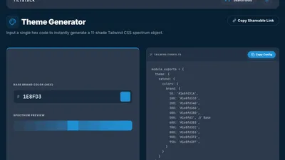
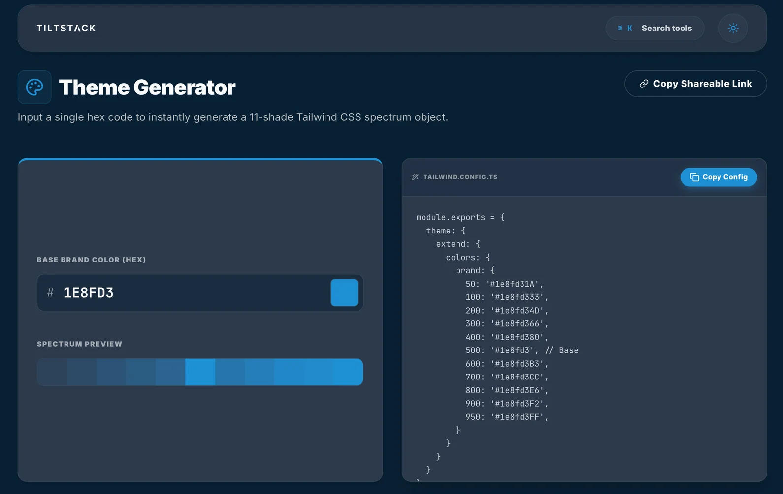
What the Tool Outputs
The Palette Generator gives you two formats,
both copyable to clipboard in one click:
Tailwind config.js format — paste directly into your tailwind.config.js:
// tailwind.config.js
module.exports = {
    theme: {
        extend: {
            colors: {
                brand: {
                    50:  '#eff8ff',
                    100: '#dbeffe',
                    200: '#b9e0fd',
                    300: '#7dc8fb',
                    400: '#3aadf6',
                    500: '#1e8fd3',  // ← your base hex
                    600: '#1272b0',
                    700: '#0d558a',
                    800: '#0a3f68',
                    900: '#072c4d',
                    950: '#041b30',
                },
            },
        },
    },
};
CSS custom properties format — for projects that consume the palette outside of
Tailwind's JIT compiler, or for sharing tokens with a design team in Figma:
:root {
    --color-brand-50:  #eff8ff;
    --color-brand-100: #dbeffe;
    --color-brand-200: #b9e0fd;
    --color-brand-300: #7dc8fb;
    --color-brand-400: #3aadf6;
    --color-brand-500: #1e8fd3;
    --color-brand-600: #1272b0;
    --color-brand-700: #0d558a;
    --color-brand-800: #0a3f68;
    --color-brand-900: #072c4d;
    --color-brand-950: #041b30;
}
Both outputs are derived from the same generation step — the rendering is just formatted
differently. The CSS variable names follow the --color-[name]-[stop] convention, which
is also how Tailwind's own CSS layer names variables when you use the @tailwindcss/vite
plugin with CSS variable output mode.
Why It Runs in the Browser
Design tokens are often the most sensitive asset in a brand system. A client's custom
color palette, typography scale, and spacing system represent decisions made across months
of brand strategy work. When those tokens aren't public yet — pre-launch products,
unreleased brand refreshes, NDA-covered design systems — you don't want them transiting
a third-party server just so you can count shades.
The Palette Generator does all computation client-side. Color conversion and shade
generation are pure mathematical operations that don't require a backend. The hex value
you enter, the palette it generates, and the CSS or config you copy: none of it leaves
your browser tab.
It also means the tool is instantaneous. There's no network round-trip on every input
change. The palette re-generates on every keystroke as you type a hex value — live
preview with zero observable latency, because the compute happens synchronously in the
same JavaScript process as the UI.
The Contrast Ratio Problem We Didn't Ignore
Generating a pretty color scale is half the job. The other half is making sure it's
accessible — specifically, that you can build UI with it that passes WCAG contrast
requirements.
The WCAG 2.1 standard requires:
- 4.5:1 contrast ratio for normal text (AA level)
- 3:1 for large text and UI components (AA level)
- 7:1 for enhanced (AAA level)
A common issue with algorithmically generated palettes: the 500 base color sits at
a lightness that's awkward for both white and dark text. Many brand blues
(around L 40–55%) fail the 4.5:1 threshold against white (#ffffff) and feel washed
out against black (#000000). The useful text color combinations are usually:
| Background Stop | Legible Text Stop | Use Case |
|---|---|---|
| 50 | 700–900 | Tinted background with dark text |
| 100 | 700–900 | Light card background |
| 500 | 50 or white | Solid button label |
| 600 | white | Hover state button label |
| 700 | white | Active/pressed state |
| 900 | 100–200 | Dark section with light tinted text |
The tool surfaces these contrast-safe combinations visually — each stop shows whether
white or dark text passes AA against that background. This is what saves the extra
twenty minutes per client of manually checking ratios in a separate contrast checker.
Integration Patterns We Actually Use
Running the palette in a SASS project (non-Tailwind): even if you're not using
Tailwind's utility classes, the CSS variable output works directly in any SASS codebase.
Drop the variables into your :root block and reference them as var(--color-brand-500)
anywhere you'd use the brand color. No Tailwind dependency required.
Theming multiple brands from one codebase: if you're building a white-label product
where different clients get different brand colors, the CSS variable approach lets you
swap the entire palette by swapping a single :root block. No rebuild required; the
tokens update at runtime.
/* Default / Client A */
:root { --color-brand-500: #1e8fd3; }

/* Client B theme override */
[data-theme="client-b"] { --color-brand-500: #e65c1a; }
The same Tailwind utility bg-[var(--color-brand-500)] orbg-brand-500 resolves correctly in both themes.
Exporting to Figma: if your design team works in Figma, the hex values from the
generated palette paste directly into a Figma color styles collection. Share the
generated CSS variable names as the canonical token names between design and
development — the palette generator's output becomes the single source of truth for both.
Try It — Takes 30 Seconds
→ Open the Tailwind CSS Palette Generator
Paste any hex code — a client's brand color, a hex from a Figma file, a value from a
design system you're integrating with. The full 50–950 scale generates instantly. Copy
the Tailwind config block or the CSS variables block. Done in the time it takes to open
a new tab.
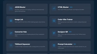
It's part of the TiltStack DevSuite — browser-native developer tools we built
for our own project workflows.
When Custom Color Palettes Get Complicated
The tool handles the common case: one brand color, a Tailwind config, a web project.
The tool does not handle:
Multi-brand design systems with semantic token layers (a "primary," "secondary,"
"surface," "error," "warning" system where each semantic role maps to a different brand
palette and must satisfy contrast requirements across dark and light themes simultaneously).
Perceptually uniform color spaces — OKLCH and OKLAB are increasingly used for
generating perceptually linear color scales. Tailwind 4.x itself is moving toward OKLCH
natively. The current tool generates in HSL, which is a reasonable approximation but
doesn't model human color perception as accurately as OKLCH-based generation.
Accessibility-first palette generation — taking a target contrast ratio as an input
and deriving the stop values backward from that constraint, rather than generating and
checking post-hoc.
These are design system engineering problems at a different scale. If you're building a
multi-brand product with a rigorous token architecture, accessibility requirements baked
into the token generation, and Figma → code design token pipelines, that's the kind of
system design work we do as part of our web design and development services.
The palette generator handles the 80% case efficiently; the remaining 20% is where
engineering judgment earns its keep.
FAQs
Q1: Why does my generated palette look slightly different from Tailwind's built-in
colors for similar hues?
A: Tailwind's built-in palettes were hand-tuned by designers using perceptual judgment —
particularly the saturation adjustments at each stop. Our generator uses an algorithmic
approximation of that curve. The output is internally consistent and usable, but it won't
be identical to what a designer would produce by hand for the same base color. For most
custom brand color use cases, the algorithmic output is entirely sufficient.
Q2: Does the tool support OKLCH output?
A: Not currently — the generator outputs #hex values and HSL-derived shades. Tailwind 4
is introducing native OKLCH support for color utilities, and OKLCH-based generation
produces more perceptually uniform scales. We're tracking whether to add an OKLCH output
mode as Tailwind 4 adoption grows. For now, the hex outputs paste correctly into any
Tailwind 3 or 4 configuration.
Q3: Can I use the CSS variable output with a Tailwind project that doesn't use theextend.colors approach?
A: Yes. In Tailwind 4, you can reference arbitrary CSS variables directly in utilities
using bg-[var(--color-brand-500)] syntax without declaring them in the config at all.
In Tailwind 3 with JIT, you can do the same with arbitrary value syntax. The CSS
variable output is consumed the same way in both cases — define the variables in :root,
reference them in your utilities.
Q4: How do I verify my generated palette passes WCAG contrast requirements?
A: Use the WebAIM Contrast Checker or
paste the hex values into your browser's DevTools accessibility panel. The key pairs to
check: your 500 against white (#fff) and against black (#000), plus your darkest
stop (950) against your lightest stop (50). For interactive components like buttons,
you need 3:1 minimum; for body text, 4.5:1.
Q5: Can I generate palettes for multiple brand colors to create a full design system
(primary, secondary, neutral, error states)?
A: Yes — run the generator once per color, change the variable name prefix when you copy
the CSS output. Naming convention: --color-primary-[stop], --color-secondary-[stop],--color-neutral-[stop], --color-error-[stop]. Each color gets its own palette pass.
For a complete design system token architecture beyond color palettes, our
web design services include token system design as part of
the discovery phase.